The Inn at Cape Kiwanda is an award-winning hotel located in the heart of Pacific City. With it being just a few steps away from the beach, wilderness, and dory boat fishing there is plenty to do here. We were tasked with refreshing their brand and web presence. I contributed to their brand development by updating their current mark. I also developed a few collateral pieces such as maps of the area, and key card holders that reduced the amount of staff they needed for onboarding. Below are samples of the mark and its color uses, as well as collateral pieces.


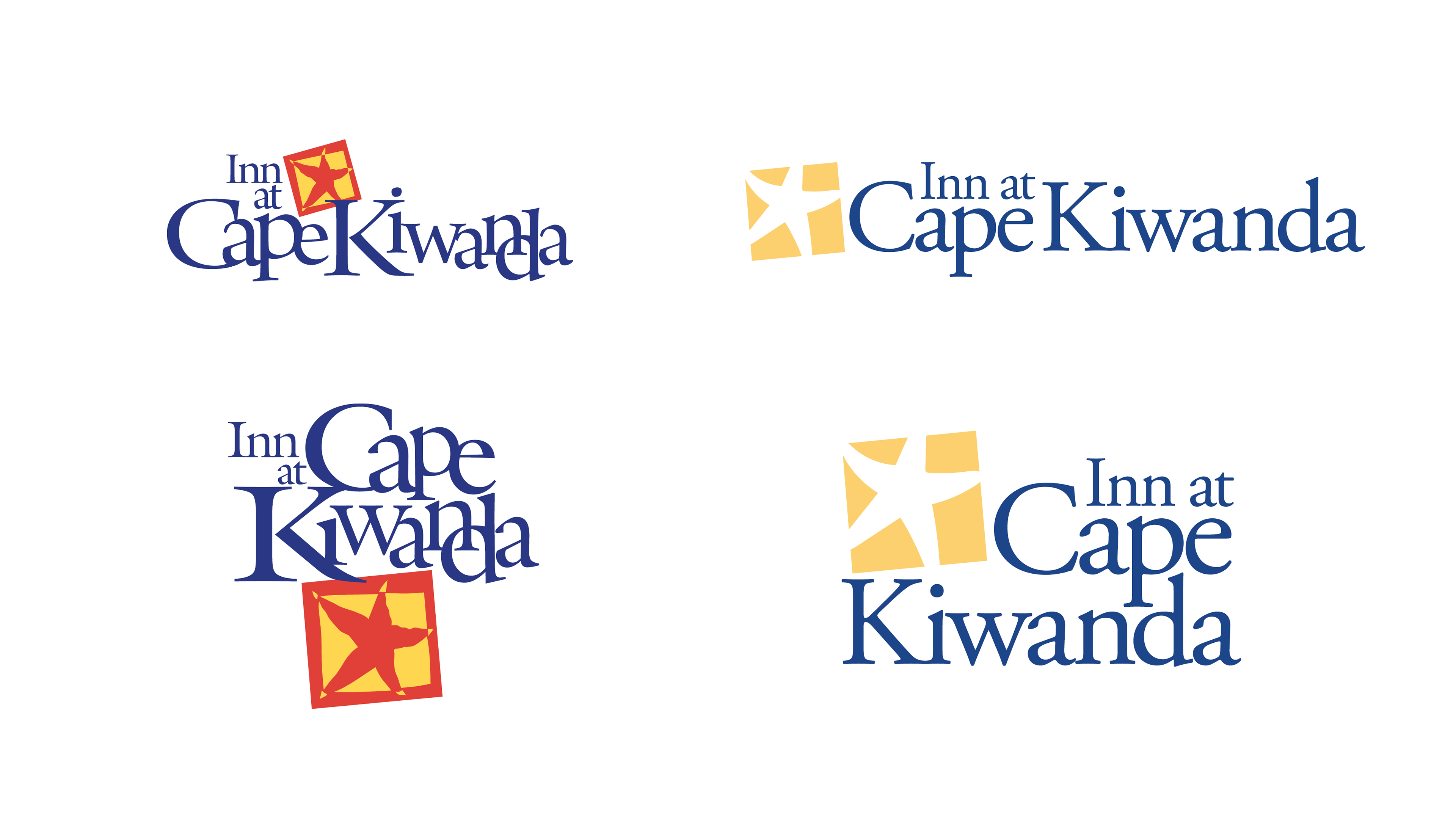
The old logo had saturated colors and type that were hard to read and only worked in few instances. The new mark simplified the color palette to be web/print-friendly and a more legible take on the type lockup.

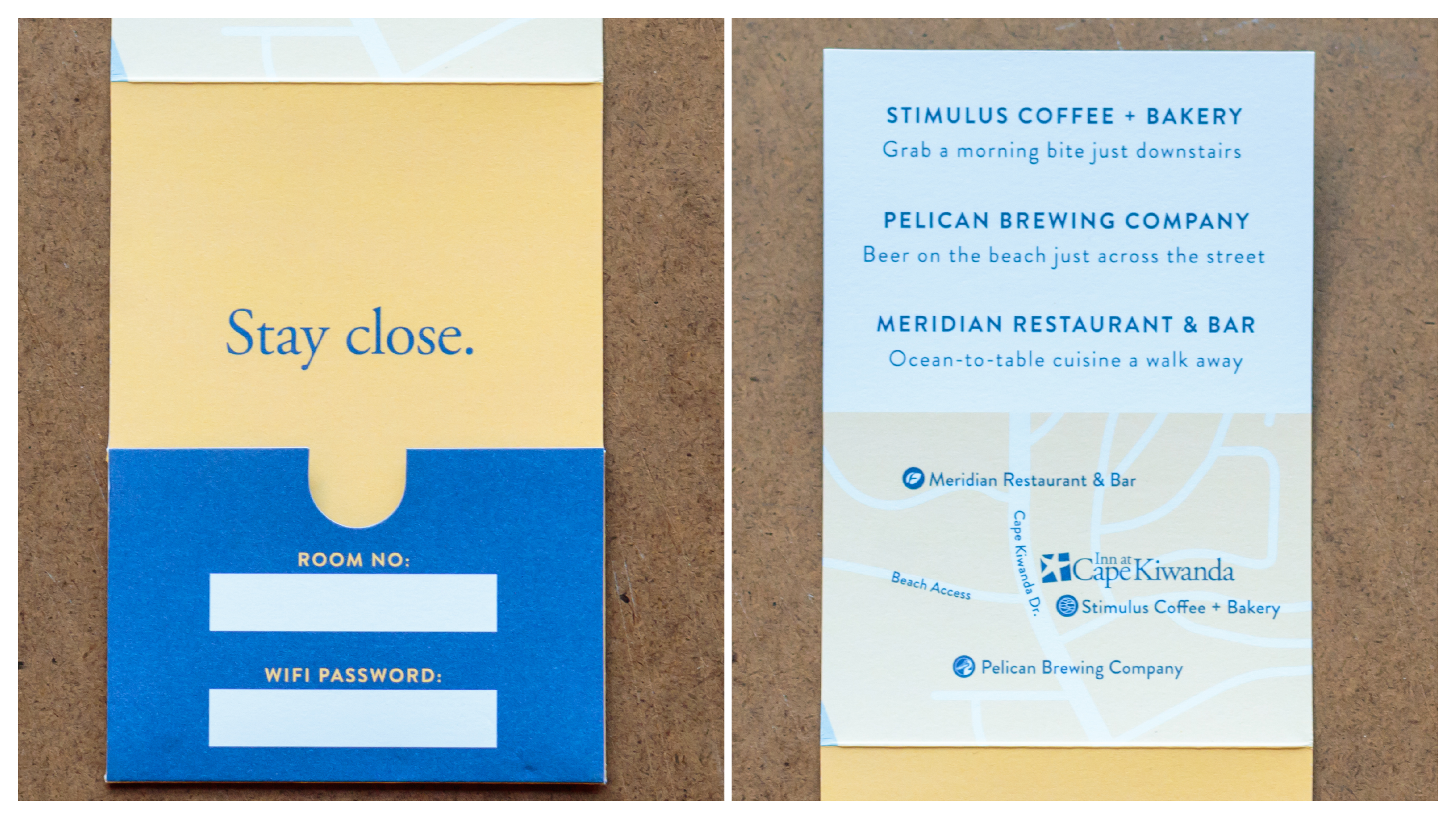
Keycard holders with things to do in the area.
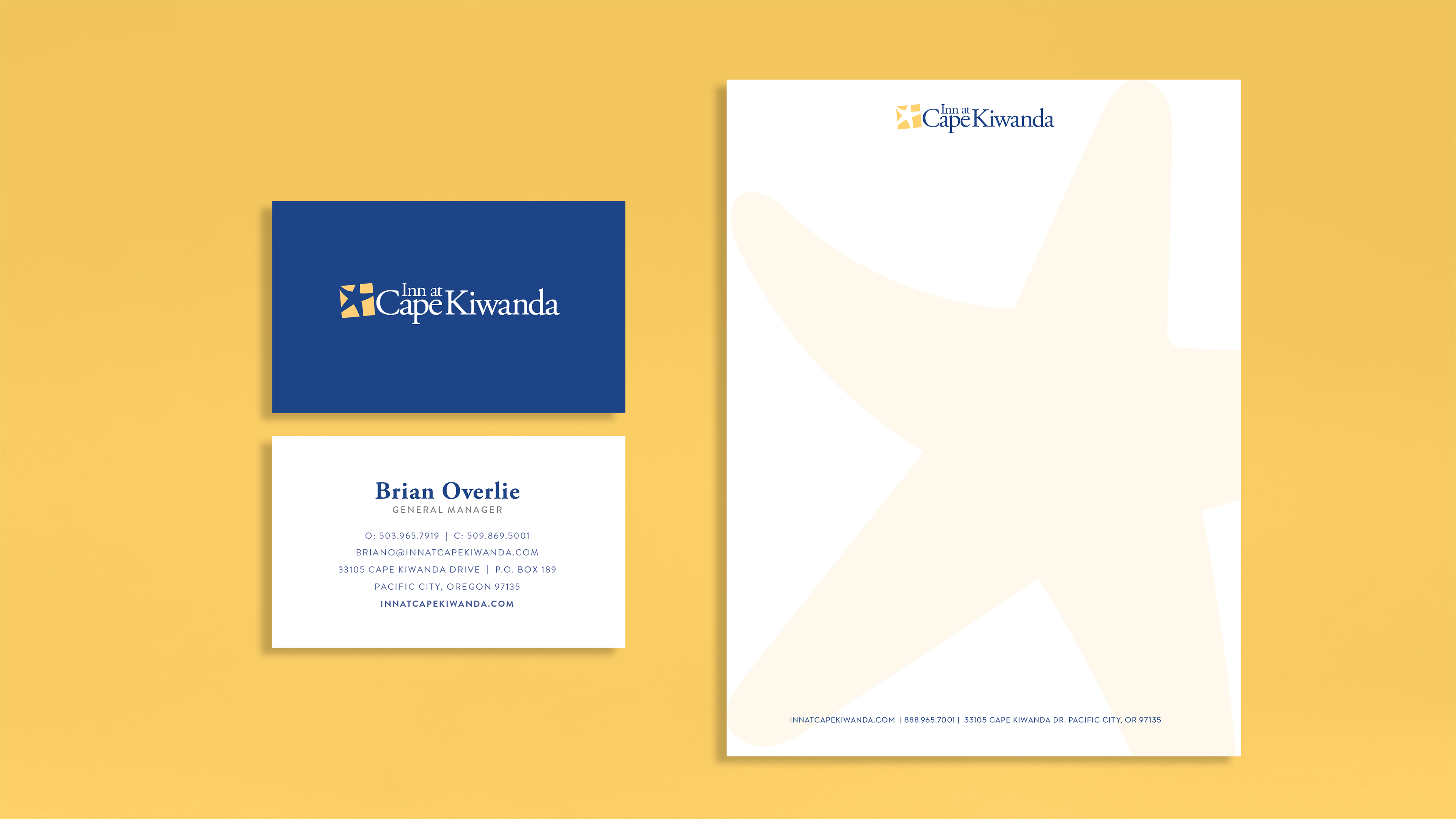
Letterhead application.
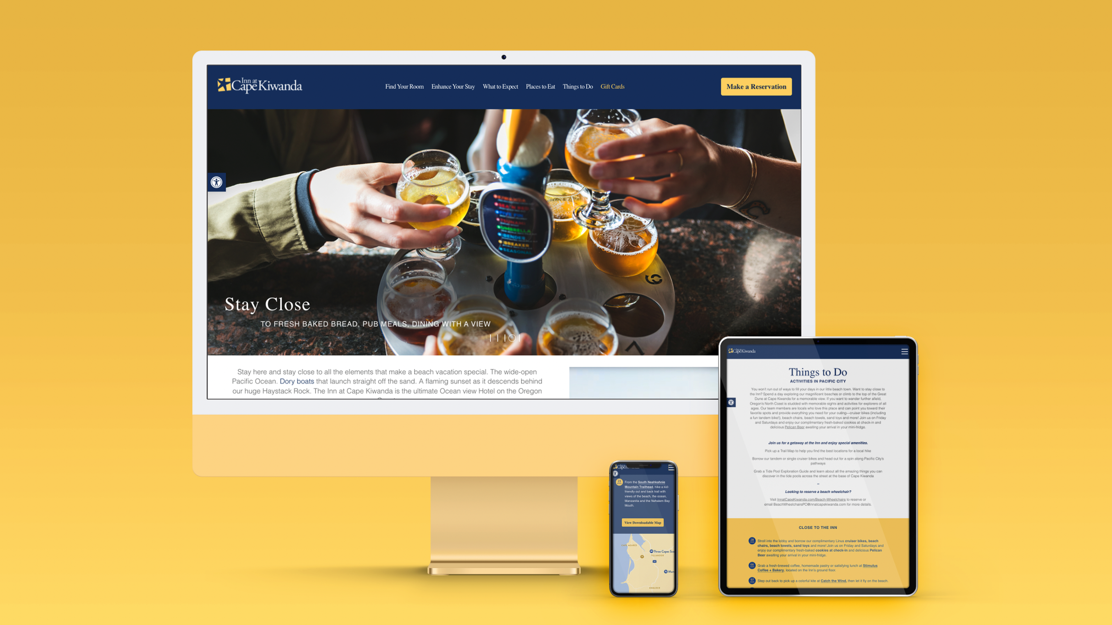
New colors and type system in use on web/mobile.
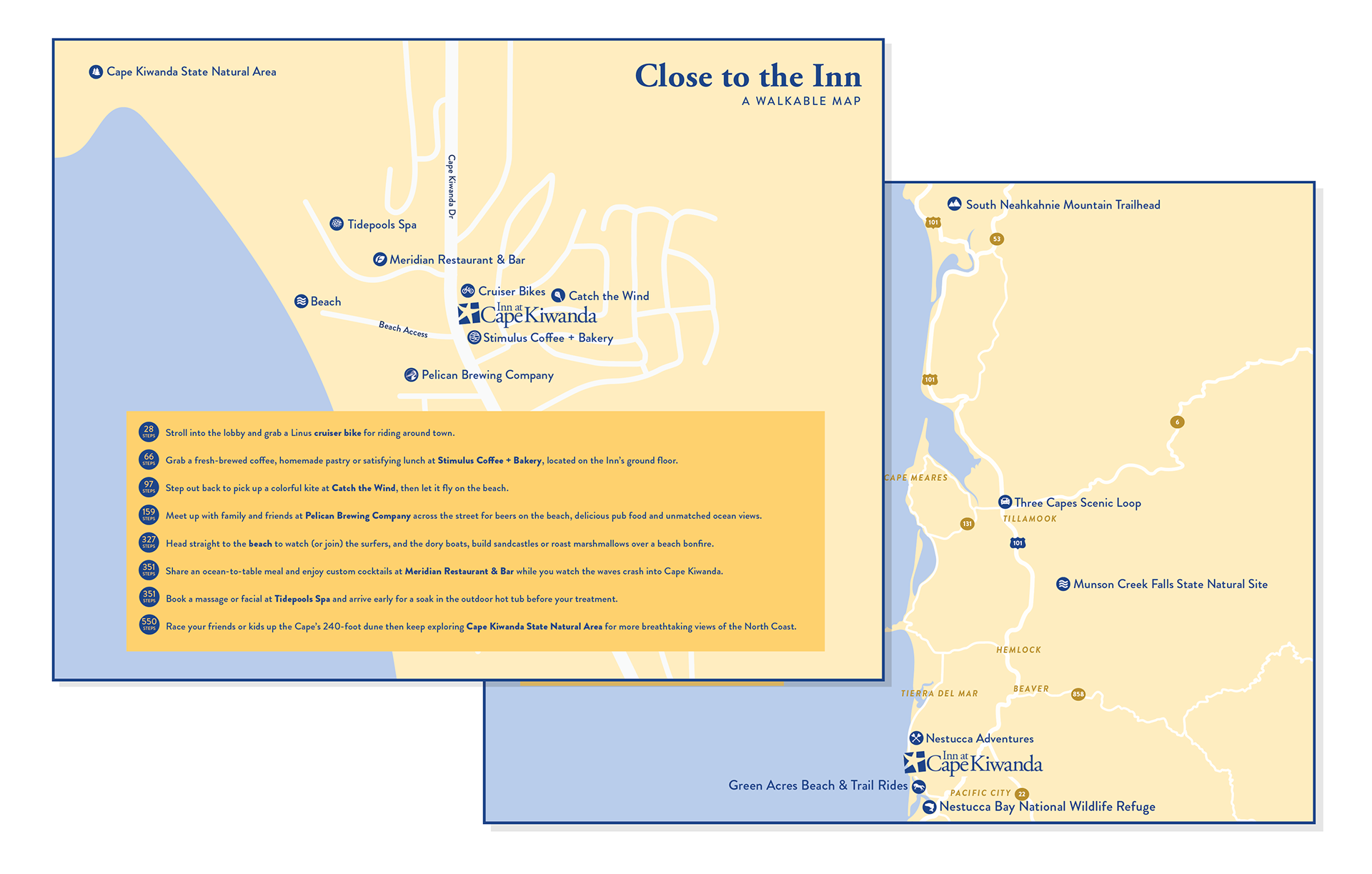
Downloadable maps that are featured on the site.

Brand pattern concept.


We finished by providing a brand book with visuals of how to use the logo, new fonts, and colors.
Agency Coates Kokes | CEO Jeanie Coates
Brand Manager Briana Romancier
Brand Manager Briana Romancier