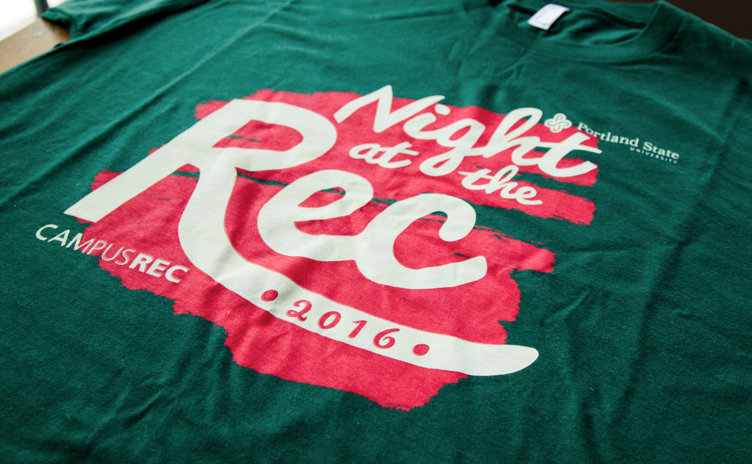
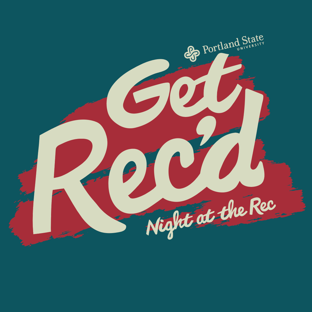
Every year Portland State Campus Rec hosts an event dedicated to incoming students of the college. The courts are full of fun activities, a photo booth, free food, and tons of information from all the different Rec Clubs and student coordinators. It's a great time to learn what the Rec Center is all about. Each year the branding changes, and I was asked to design a brand and shirt design for this event.
FUN & ACTIVE
I wanted to create a design that evoked the feelings of our urban forest we call Portland, but also promote an active visual feeling. With this in mind I wanted to include forest color tones, but use the red accent to promote being active. I digitally wrote out the mark and created a painted texture for the background to make the mark pop.
EARLY CONCEPTS
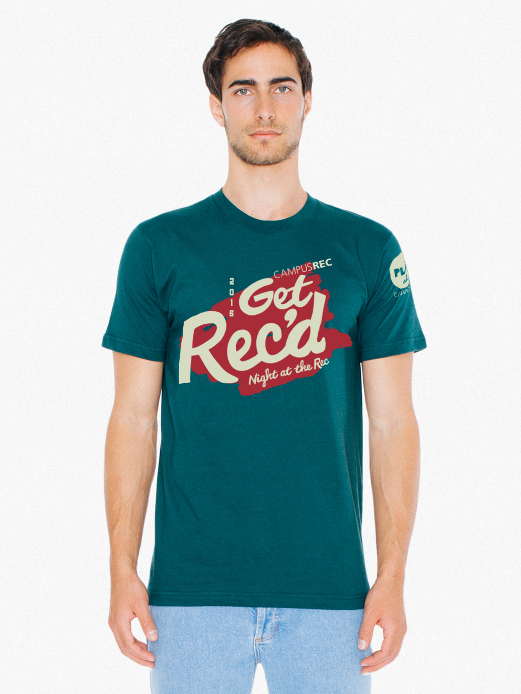
This version was created at first to make the emphasis less on the event name, and to create a design that could be used throughout the year. We went with "Night at the Rec" instead due to different requirements from other departments.
SKETCH
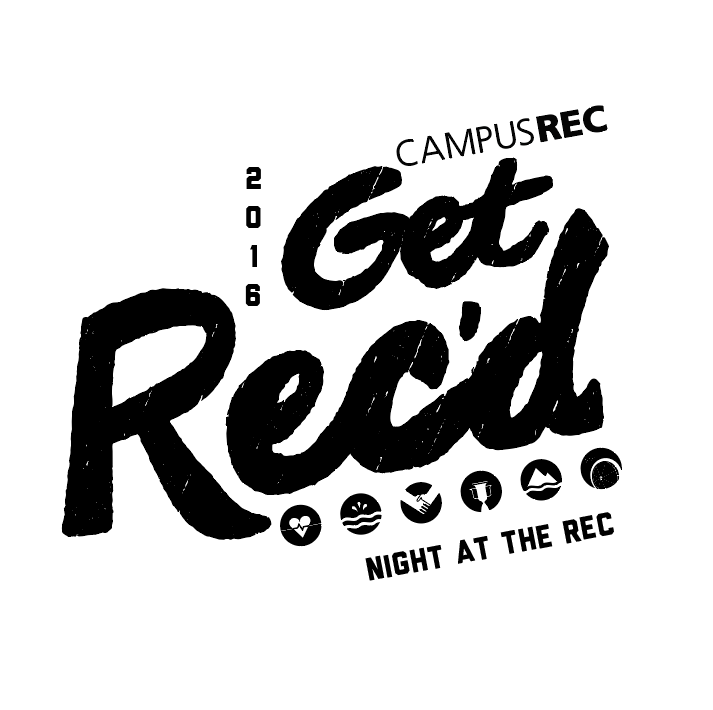
Lots of visual research was done on athletic wear and university branded apparel. I wanted to bring the idea of big bold letterforms but make it more playful by creating these by hand.
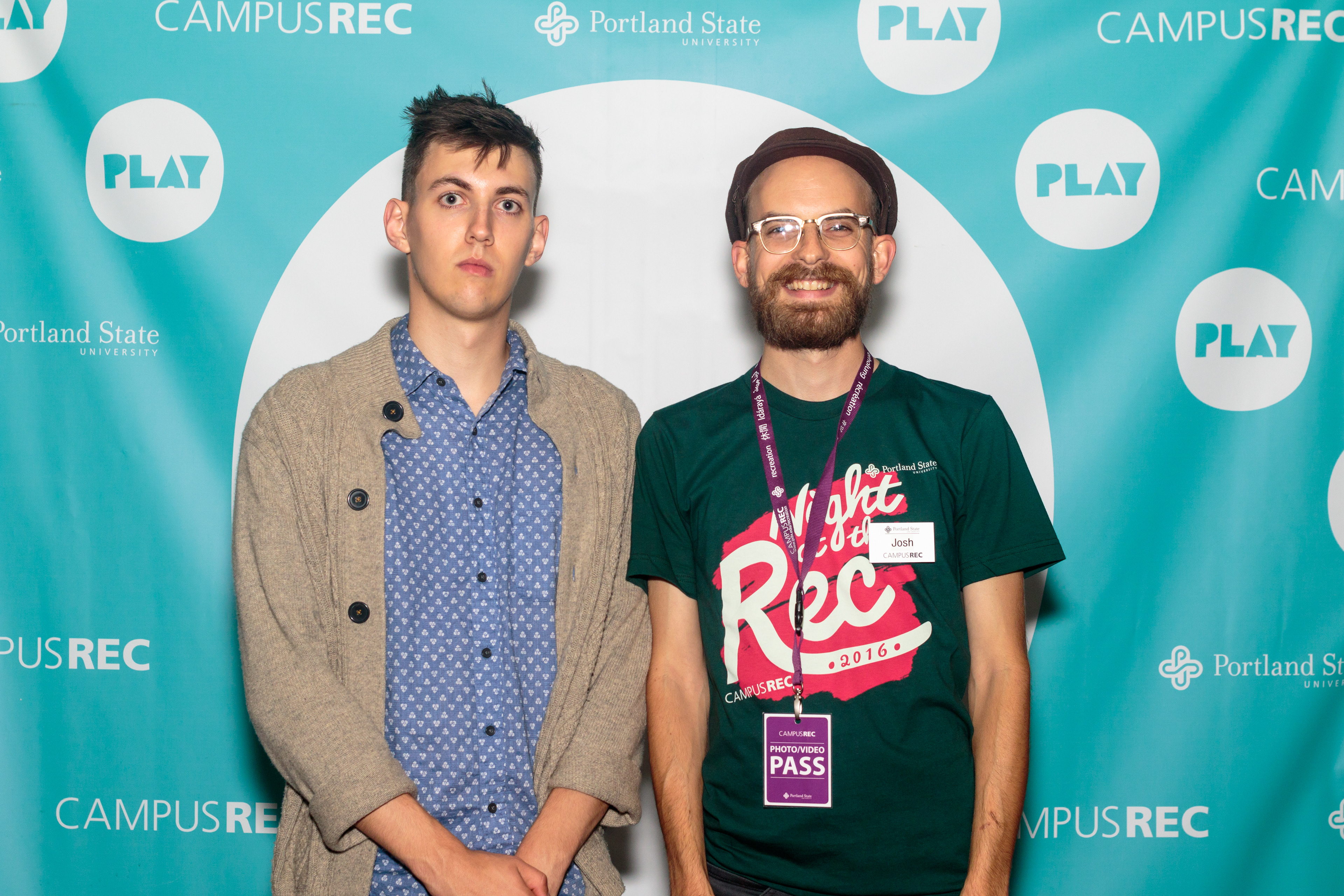
Photobooth shot of staff member in shirt
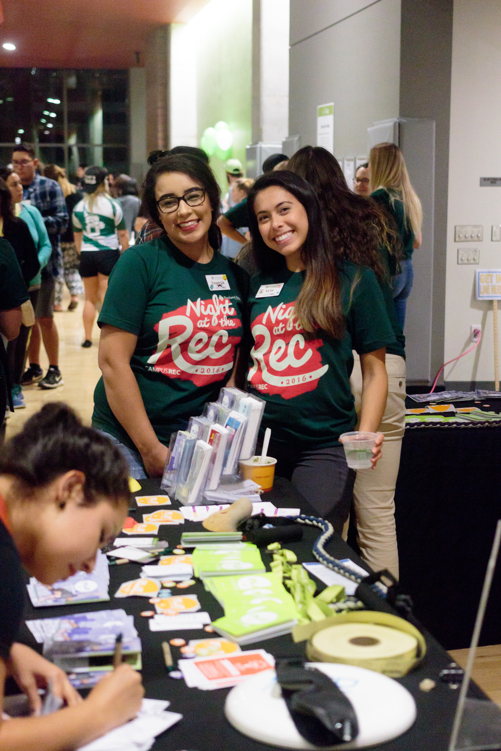
Event photo from Night at the Rec